Using R markdown and ggplots for data visualisation
Updated:
R Markdown is a file format for creating dynamic documents with R by writing in markdown language. The document contains chunks of embedded R code and content blocks. Markdown is a simple formatting syntax for authoring HTML, PDF, and MS Word documents that can be used to document and share the results of data processing and analysis including visualisations with others.
ggplot is a data visualization package for the statistical programming language R. It implements a Grammar of Graphics as a scheme for data visualization which breaks up graphs into semantic components such as scales and layers.
In this blog post I will be exploring the use of R Markdown with ggplot to produce visualisations and communicate data insights.
Getting Started
To get started with R Markdown (rmd), the user must create an R Markdown, or a Notebook file. Typically this will be done in an R integrated development environment such as RStudio, a tool that most data scientists are familiar with.
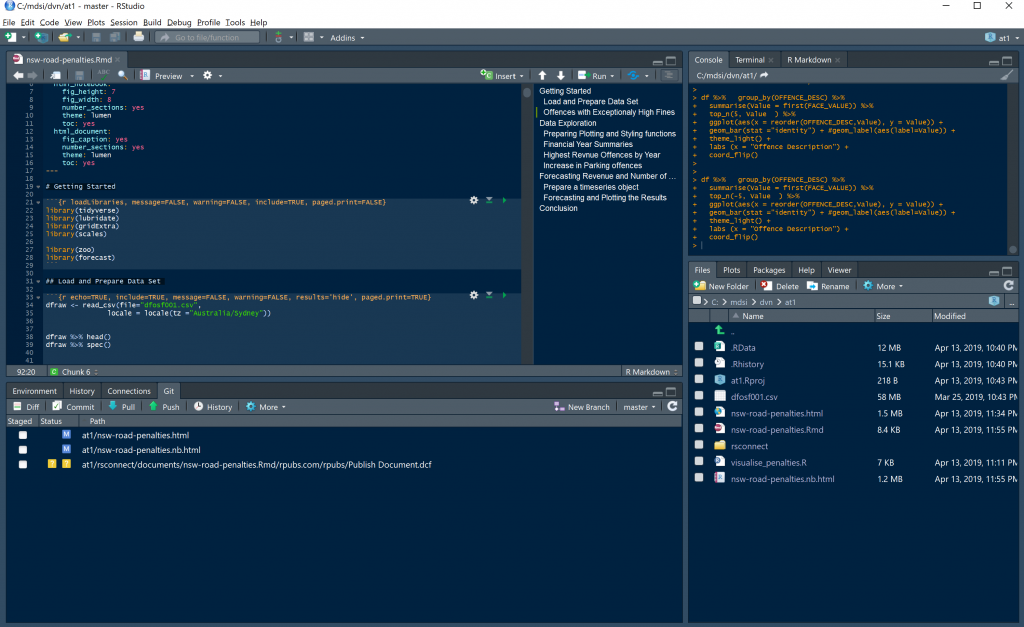
Once you have created the rmd file, you now ready to start writing code to perform the usual data preparation and exploration activities.
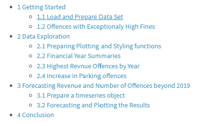
All the code used to prepare for this blog post is published as an R Markdown on rpubs at this link: http://rpubs.com/mutazag/NSW-Road-Offences-and-Penalties. The process I followed is summarised in the table of content for this R Markdwon file.
The Data Set
The data set used for this post is the same NSW Roads Offences and Penalties data that I used in my previous posts for exploring the use of PowerBI and Tableau for building data visualisations and stories.
I am using the tidyverse package for loading and manipulating the data set. Some basic data preparation was required to correct the data type for the OFFENCE_MONTH field, and to select a subset of fields that are required for this analysis.
# load the data set while setting the timezone locale to "Australia/Sydney"
dfraw <- read_csv(file="dfosf001.csv",
               locale = locale(tz ="Australia/Sydney"))

# examine the data set and the data specs
dfraw %>% head()
dfraw %>% spec()


# changing the data type for OFFENCE_MONTH to date
dfraw$OFFENCE_MONTH <- dfraw$OFFENCE_MONTH %>% dmy()

# selecting a sub set of columns
df <- dfraw %>%
  select(OFFENCE_FINYEAR, OFFENCE_MONTH, OFFENCE_CODE, OFFENCE_DESC, FACE_VALUE, TOTAL_NUMBER, TOTAL_VALUE)
Producing summaries of the data set is another data manipulation task that are commonly performed at this stage of the analysis.
In the example below, a summary data set is created to inspect the data range of the offences, total number and value of offences, minimum and maximum offence face value, and total number of records in this data set.

Data Exploration
This basic summary is already producing some insights: the minimum offence face value is $20, whilst the maximum offence face value is a whopping $18,455.
At this stage, the user may want to find out what other offences attract large fines. To produce such result in R, the user must query the data, produce a data frame with the required results and then produce a visualisation that meets their requirements, such as the stacked bar chart below.
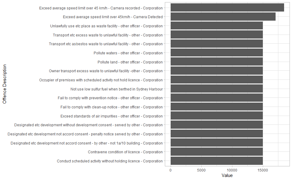
The above visualisation is based on a bar chart plot. To produce the aesthetics in this plot, I applied a theme setting to control the borders, grid lines and general style elements, specify the text labels for axes and flip the plot coordinate. These tasks are achieved using the code below.
df %>%   group_by(OFFENCE_DESC) %>%
  summarise(Value = first(FACE_VALUE)) %>%
  top_n(5, Value  ) %>%

  # Specify x and y axes
  ggplot(aes(x = reorder(OFFENCE_DESC,Value), y = Value)) +

  # Choose a bar chart
  geom_bar(stat ="identity") + #geom_label(aes(label=Value)) +

  # apply a theme
  theme_light() +

  # set x axis label
  labs (x = "Offence Description") +

  # flip coordinates (x axis becomes y axis)
  coord_flip()
The user often needs to continue transforming the data set to make and suitable for producing the different required visuasliations. For example, performing aggregate summaries on numerical fields (such as the Total Value of offence) by financial year or Offence Description first, then calling the appropriate plotting functions to display the results in a visualisation
Reproduce and Reuse Plotting Code
One of the key benefits of using a coded approach to generating visualisations is the ability to reproduce and reuse the code with different data sets.
In this example, the R function below de-clutters a plot by setting the theme for the plot then applying additional aesthetic to remove panel grid.
# decluttering theme
theme_dvn <- function() {
  retTheme = theme_minimal() +
    theme(panel.grid = element_blank())

  return(retTheme)
}
Some simple formatting tasks require extensive code, for example, formatting numbers to display suffixes instead of the whole number. The code below is used to achieve this task. This function is good example of code re-usability, as I did not have to write it my self, instead I was able to reuse the work of others that already solved this problem.
# numbers metric formatter
format_si <- function(...) {
  # Format a vector of numeric values according
  # to the International System of Units.
  # http://en.wikipedia.org/wiki/SI_prefix
  #
  # Based on code by Ben Tupper
  # https://stat.ethz.ch/pipermail/r-help/2012-January/299804.html
  # Args:
  #   ...: Args passed to format()
  #
  # Returns:
  #   A function to format a vector of strings using
  #   SI prefix notation
  #

  function(x) {
    limits <- c(1e-24, 1e-21, 1e-18, 1e-15, 1e-12,
                1e-9,  1e-6,  1e-3,  1e0,   1e3,
                1e6,   1e9,   1e12,  1e15,  1e18,
                1e21,  1e24)
    prefix <- c("y",   "z",   "a",   "f",   "p",
                "n",   "µ",   "m",   " ",   "k",
                "M",   "G",   "T",   "P",   "E",
                "Z",   "Y")

    # Vector with array indices according to position in intervals
    i <- findInterval(abs(x), limits)

    # Set prefix to " " for very small values < 1e-24
    i <- ifelse(i==0, which(limits == 1e0), i)

    paste(format(round(x/limits[i], 1),
                 trim=TRUE, scientific=FALSE, ...),
          prefix[i])
  }
}
The entire plotting process can be wrapped in a function, and the function can be designed to accept a dataframe object, along with any other parameters, then generate the plot according to logic in the code. The following function produces a bar chart after applying the de-cluttering theme and number formatting functions prepared earlier.
# plotting function
topPlot <- function(df, v){

  df %>% group_by(OFFENCE_FINYEAR) %>%
    summarise(Value = sum(TOTAL_VALUE), Number = sum(TOTAL_NUMBER)) %>%
    ggplot(aes(x=OFFENCE_FINYEAR, y=!!as.name(v))) +
    geom_bar(stat = "identity") +
    labs( y = v,
          x = "Financial Year",
          title = paste0(v, " of offences by Financial Year")) +
    scale_y_continuous(label=format_si()) +
    theme_dvn()-> returnPlot

  return(returnPlot)
}
Generating different bars for different parameters becomes as easy as invoking the function by passing in the dataframe for plotting.
df %>% topPlot("Number")

df %>% topPlot("Value")
The above code generated the following two plots.
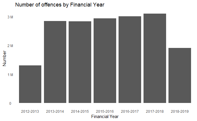
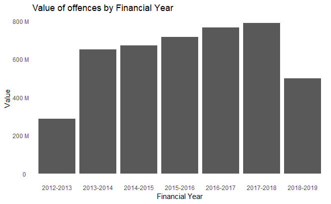
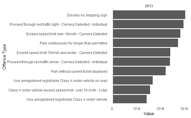
More complex scenarios can be achieved with high levels of code re-usability as shown in the example below. The data frame was prepared to calculate top parking offences for each year separately, the loop in the code applied the plotting settings on each of the sub sets to create a list of plots. At the end of the process the plots are displayed for each year by calling the print function on the list of plots.
# aggregates data set by year

df %>% mutate(Year = year(OFFENCE_MONTH)) %>%
  group_by(Year, OFFENCE_DESC) %>%
  summarise(Value = sum(TOTAL_VALUE)) %>%
  #tally (TOTAL_VALUE) %>%
  top_n(10, Value) %>%
  ungroup() -> df2


# loop to create a list of plots by year
pl <- c()

for (y in 2013:2019){
  df2 %>%
    filter(Year == y) %>%
    ggplot(aes(x = reorder(OFFENCE_DESC,Value), y = Value)) +
    facet_grid(cols = vars( Year)) +
    geom_bar(stat ="identity") + #geom_label(aes(label=Value)) +
    theme_dvn() +
    labs( x = "Offence Type")+
    scale_y_continuous(label=format_si())+
    coord_flip() -> p

  pl[[toString(y)]] = p
}

# display the list of plots
print(pl)
The output of this code is a series of visualisations, similar to the one shown below, one for each year from 2013 to 2019.
Insights from Visualisations
So far, we’ve seen how R and ggplot can be used for data exploration activities. R provides a great platform for machine learning and advanced data analytics.
In this example, I am using the platform to forecast the number of offences and revenue. The example demonstrates a very basic time series forecasting process using the forecast library in R.
First, I needed to prepare the data in a time series object format.
df %>% group_by(OFFENCE_MONTH) %>%
  summarise(Value = sum(TOTAL_VALUE),
            Number = sum(TOTAL_NUMBER)) %>%
  ungroup() %>%
  select(Value, Number) -> tsdf
ts1 <- ts(tsdf,
          start = c(year(dfSummary$`From Date`), month(dfSummary$`From Date`)),
          frequency = 12) %>% head(-1)

# time series plotting function is prepared for re-usability
plot_ts <- function (obj, endyear = 2019){
 return(
   autoplot(obj) + theme_dvn() + scale_y_continuous(label = format_si()) + scale_x_continuous(breaks = 2013:endyear)
 )
}

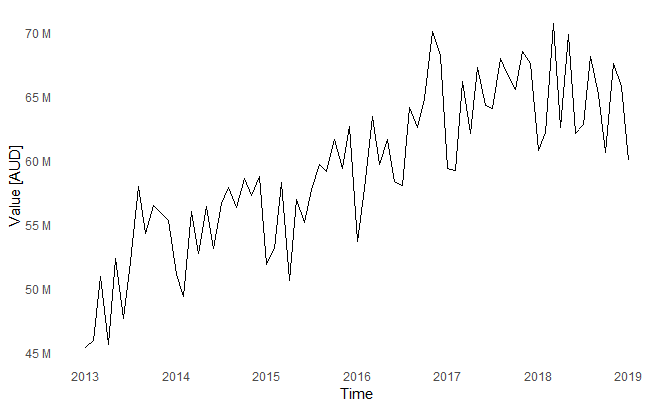
plot_ts(ts1[,1]) + labs(y="Value [AUD]")
The plot shows the change in revenue overtime. All the plot formatting functions that were prepared earlier are used to produce this visualisation.
Then using the forecast library, I am training an ARIMA model and forecasting for the next 24 months.
# Train the model
revenueFit <- auto.arima(ts1[,1])

# Forecast
revenueForecast <- forecast(revenueFit, h =2*12)

# Plot the output
plot_ts(revenueForecast, endyear = 2021) + labs(y="Value [AUD]", title="Revenue Forecast")
The output in this case shows historical and foretasted revenue. The shaded areas represent the forecast confidence intervals.
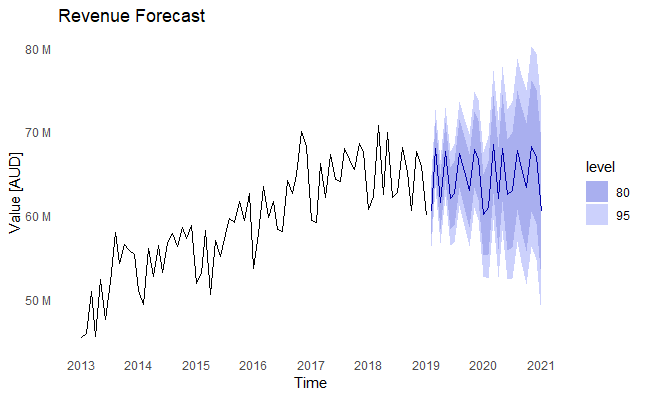
It is important to note that the forecasting performed in this example is for explanatory purposes only, and is only meant to demonstrate the ability to forecast with this data set.
Producing meaningful forecasts requires deeper analysis of the timeseries data set and its decomposition, and proper validation of forecast errors and accuracy on a test data set before accepting any of the forecasting results.
Publishing the Output
RMD allows you to control the theme used to format the output document and whether to include a table of content or not in the output.
The user could achieve this by including document output attribute in the header of the rmd file show in the code snippet below.
---
title: "NSW Road Offences and Penalties"
output:
  html_document:
    fig_caption: yes
    theme: lumen
    toc: yes
---
The knitr library in RStudio provides the feature to publish the output as an html page, or other document formats such as Microsoft Word.
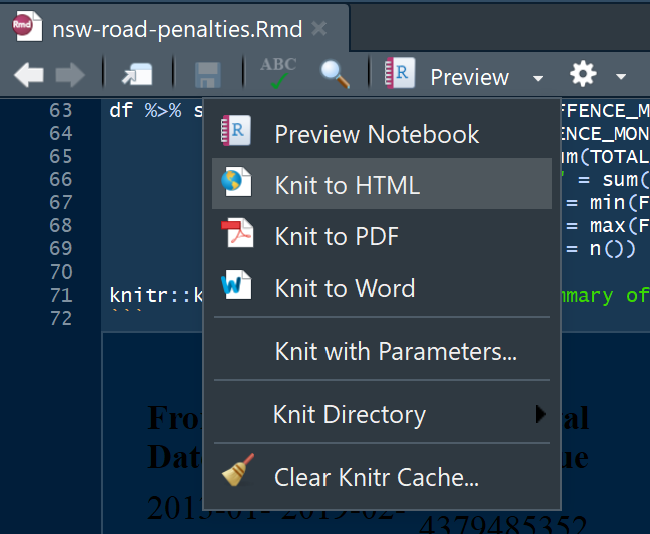
The ‘knitted’ output can then be published to the web for sharing with others on platforms such as Rpubs, as shown in the published document for this exercise on this link.
Conclusion
This post demonstrated some of the possibilities for using a coded approach to generate data visualizations with R and ggplot. It walked through the process to prepare the data set for specific plotting requirements, then calling the plotting functions and customising the elements of the plot.
Control of output, reproducibility of results and reusable code are some of the key benefits of this approach, but it requires technical knowledge of data preparation and plotting libraries, and coding experience. It is mostly an approach to use data scientists or developers. With careful design, developers can write modular code to minimise code duplication.
It is hard to compare this approach to other business intelligence tools, such as Power BI and Tableau, as the purpose and target user base for R, ggplot and RMarkdown is not necessarily the typical business user or data analyst. This approach is very flexible and great for complex data preparation and analysis, something that data scientists need in their tool set.

Comments