
Using Power BI to explore the NSW Penalty Notices data set
Updated:
In this series of blog posts I am evaluating the use of different visualisation tools for building data narratives.
Microsoft Power BI is the tool of choice for me since I am most familiar with, so I decided to start this series with a post on Power BI.
The other tools that I will use are Tableau and ggplot2.
Getting Started
There are two main product offerings to get started with Power BI: Power BI online and Power BI desktop.
Getting started with Power BI online is easy, all you need to do is to login to https://powerbi.microsoft.com using an organisation (work or school) account. UTS students can use their UTS account to login to this service. This service is not available to public consumers coming in through consumer accounts such as hotmail or gmail.
On the other hand, Power BI desktop is available to download for free https://powerbi.microsoft.com/en-us/downloads/. If paired with an online account, the user can use the desktop app to publish their reports to the web.
I decided to start with the desktop tool since it allows me to work offline and it also offers rich data preparation and modeling features to prepare my data, check my post on data preparation using Power BI desktop.
The Data Set: Penalty Notices in NSW
I was interested in exploring data related to driving offences and fines, and my research led me to the open data web site for the government of NSW. On the website I was able to locate the data set for Penalty Notices in NSW in the last 5 financial years, this data set is published by Revenue NSW.
The data set (download it here) is published with data dictionary to describe its content and the fields included in the data set.
The data set includes aggregate summaries of offence notices recorded for every month in the time period covered by the data set.
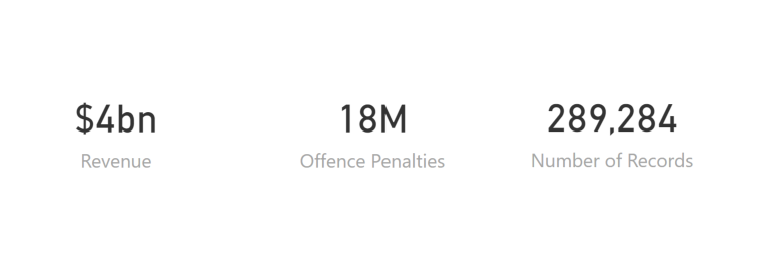
The data set is a comma-separated values (CSV) text file of penalty notices loaded to the fines system on or before 28/02/2019. Penalty notices with an offence date within the last five full financial years and the current financial year, and penalty notices with an offence date on or before the last calendar day of last month.

The following are key fields of interest to this exercise:
| Field name | Data type | Description |
|---|---|---|
| OFFENCE_FINYEAR | String | The financial year of the penalty notice |
| OFFENCE_MONTH | Date | The first day of the month of the penalty notice |
| OFFENCE_CODE | Integer | A unique identifier for the offence |
| OFFENCE_DESC | String | The description of the offence |
| LEGISLATION | String | The legislation creating the offence |
| FACE_VALUE | Number | The penalty amount for the offence ($) |
| TOTAL_NUMBER | Integer | The total number of penalty notices issued |
| TOTAL_VALUE | Number | The total face value of penalty notices issued ($) |
Import the data set
Power BI allows you to get data from various sources, in this case it was a text file. It also supports getting data from database systems, and various cloud and online services, which makes it very easy to bring in any data needed for visualisations and model multiple sets from different data sources together.
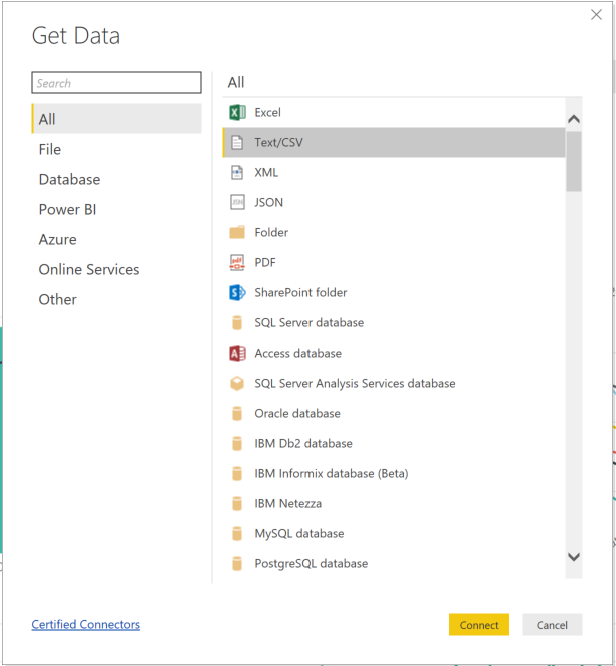
Getting this dataset in Power BI is as simple as specifying Text/CSV as the type of the data source and then pointing to the file path for the CSV.
No real data preparation or cleansing was required for this data set, all I did was to drop the fields that I am not planning to use, and ensure that date fields are dates and numeric fields are numeric.
In my previous blog post I showed how to import the data and perform basic data preparation tasks: Data Prep in Power BI, Load Data and Skip First n Rows.
Building Visualisations
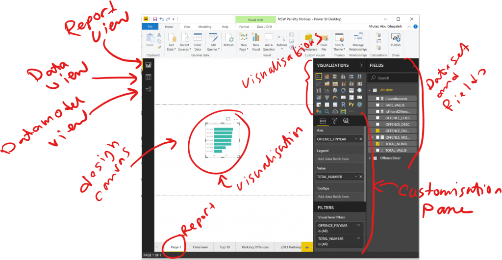
Power BI uses a couple of key constructs to build visualisations and it provides user interface functionality to interact with these building blocks:
- Data set: import data sets, customise the query, cleanse data, and data modelling
- Visualisation: single visualisation element displays plots such as scatter plots, bar charts, tables and many additional custom visualisations obtained from the market place such as box plots, maps visualisations
- Report: report is a collection of visualisations and visual components, such as text labels and images, that are placed together on a single design canvas. Visualisations within a report can interact with each other to allow behaviors such as filtering based on user selection
- Dashboards: are published on the web and allow user to combine a number of visualisations and reports in single pane.
Building a visualisation is as simple as dragging and dropping a visualiastion on the report design canvas, then selecting the fields and customisation options.
Start combining visualisations together in one report page and you can quickly produce a report view that looks like the following.
Building The Data Story
To build the data story, I put together a couple of report pages to walk through the insights from the exploration on this data set.
Check the following video for the final result and some tips on how it was built using Power BI.
You can access this report by following this link:https://bit.ly/mutaz-dvn
Now Explain this!
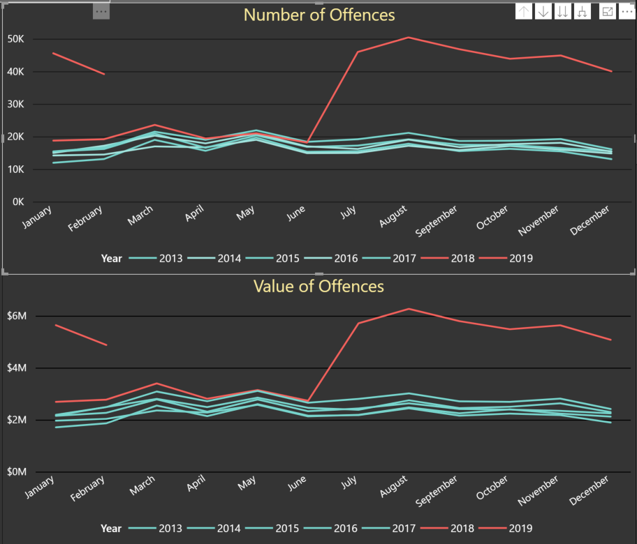
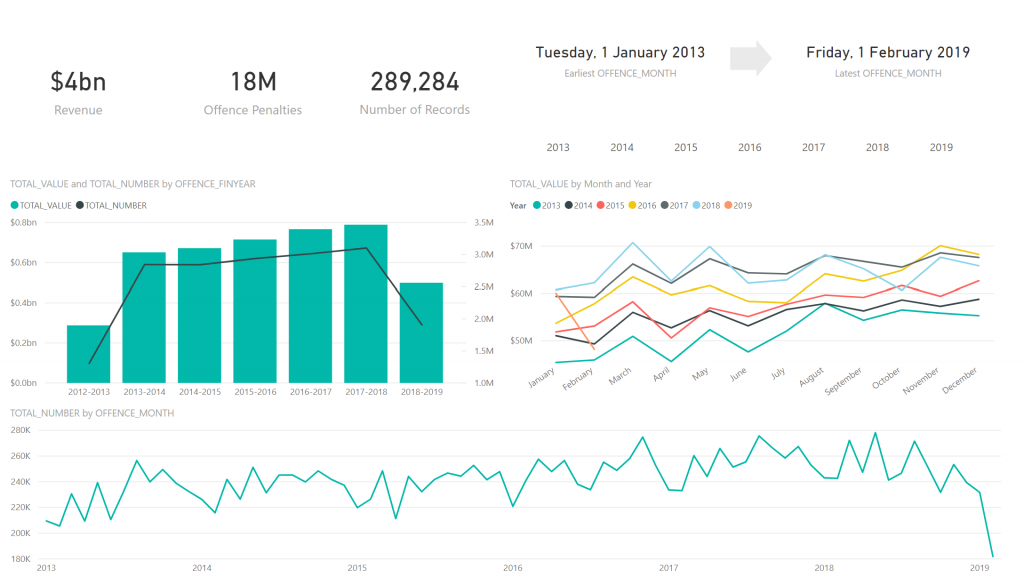
There is an increase in number and value of parking-related penalties after June 2018 which seem to continue into year 2019!
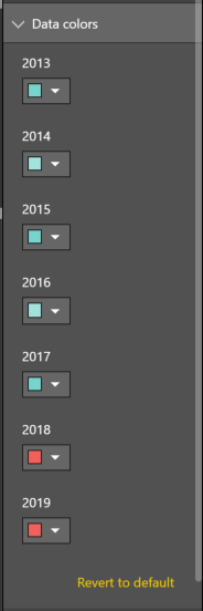
The lines for 2018 and 2019 data are highlighted in a different color to draw the users attention to this insight. Power BI allows you to customise the colors used in the visualisation by using the Format option in the Visualisations tab.
At this stage, once an insight like this one is discovered, you probably want to delve deeper in the data to understand this change and draw more insights from it.
Power BI has a nice feature that can help you in explaining this change. By right clicking on the July 2018 data point in the line chart, Power BI suggests an option to explain the increase shown in the visualisation.
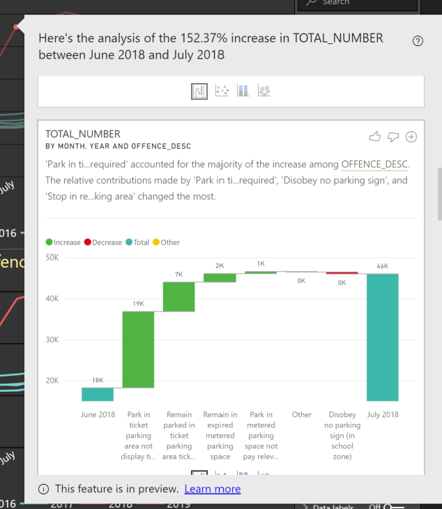
“Park in ticket parking area not displaying ticket as required” accounted for the majority of increase in number of parking related offences between June and July 2018.
Power BI automatically suggested a visualisation to show the increase in parking offences between June and July 2018, broken down by different types of offences highlight the relative contribution to this increase in parking offences. It even proposed some narrative to describe the insight.
Conclusion
Power BI is a great tool to get you from raw data to insights very quickly. It can be used to process and prepare data for visualisation using its built-in data query and modeling features.
The visualisations produced by Power BI are highly interactive, it provides a lot of control to change and format the visualisations to your liking. Power BI marketplace offers more custom visualisaions built by both Microsoft and the community which plug in directly into Power BI. The software development kit for Power BI allows developers to custom build their own visualisation components and to add them to the marketplace.
Data insights features in Power BI, such as the “Explain …” feature allows the user to quickly draw insights from the data that otherwise would have taken more time to find.
Power BI online does not include the data cleansing and modeling capabilities that are found in Power BI desktop, which means that you need to clean the data set in another tool before you can start using it in Power BI online.
Power BI desktop, whilst it is free to use for everyone, is only available to run on Windows computers. Users with Mac OS will need to run software such as Parallels or Turbo.net in order to run Power BI desktop.
Sharing your Power BI reports online with others is achievable by publishing the report as a web page from Power BI online. If the user wants to share the report securely, because it contains sensitive data, then the user needs Power BI Pro license.
Comments