
Using Boxplots for Data Exploration
Updated:
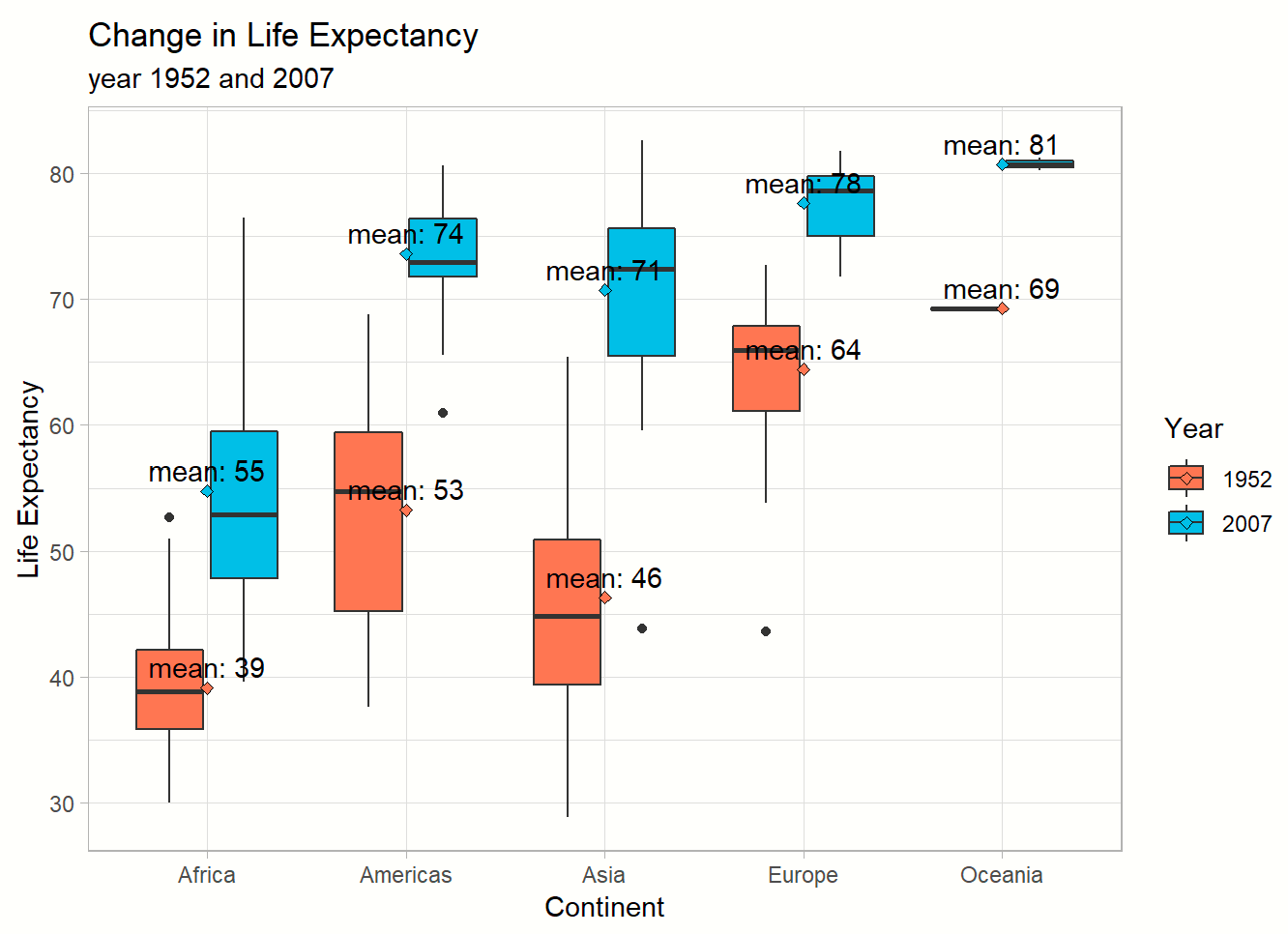
In this vignette I will explore the use of charts to display basic descriptive statistics in order understand the mean and spread of a variable in a dataset. First I will use the summary() function in R, plot a histogram to show the distribution of the variable, then use a boxplot to further examine the distribution of the variable and highlight key data points that represent the mean, median, 1st and 3rd quantiles and outliers.
Comments